Family Emblem
Illustration · Emblem Design
Overview
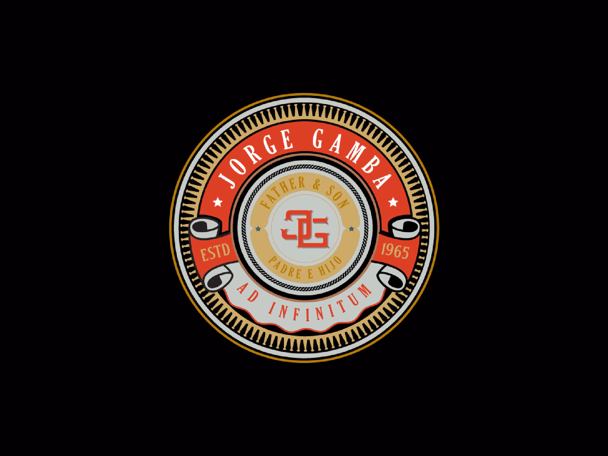
This project started with a conversation. A friend came with a simple but personal ask, an emblem for a family hat, something that felt his. No formal brief, no mood board. Just a handful of things he's loved his whole life, handed over as direction. The challenge was to take that raw, personal input and turn it into a graphic that could hold its own as a badge, bold enough to sit on a hat, meaningful enough to mean something to a family. The result landed exactly where it needed to. He loved it.
Brief & Creative Direction
The direction came straight from the client's personality, activities he's drawn to, references that have followed him through life. From that conversation, a visual concept took shape: an emblem format with strong symmetry, graphic weight, and an identity rooted in sport and movement. The goal was never decoration. It was recognition, something he'd look at and immediately see himself in. Every design decision was filtered through that lens. If it didn't feel like him, it didn't stay.
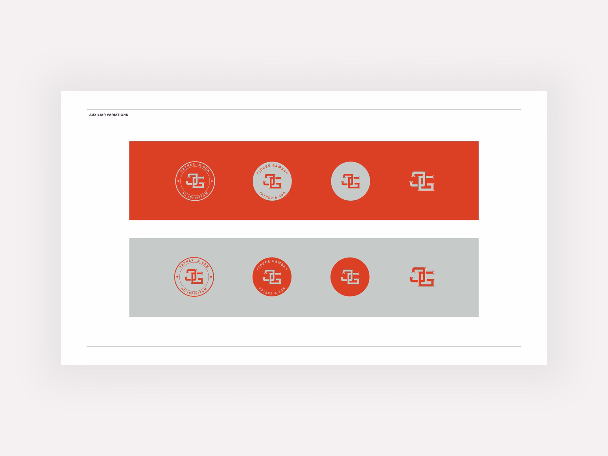
Illustration & Refinement
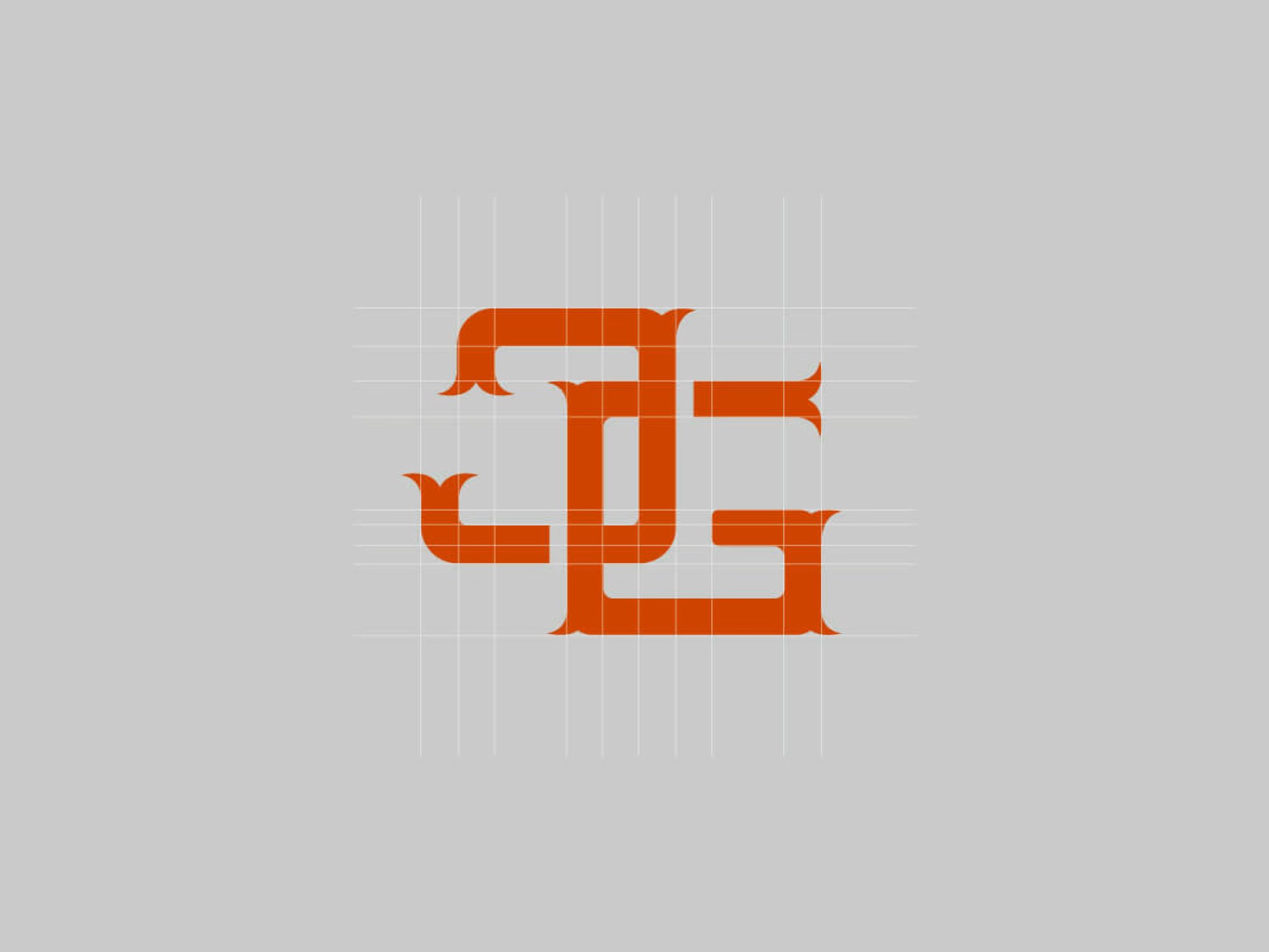
With the concept locked, the illustration was built up in stages, starting with the structural composition of the emblem, then layering in the graphic detail that would give it character. Linework, shape, and hierarchy were all considered carefully to make sure the piece read clearly at the scale it would actually live at: small, stitched, worn. Refinement rounds were tight and focused. The client's reaction drove the direction, and the feedback was immediate. This was right.
Deliverable
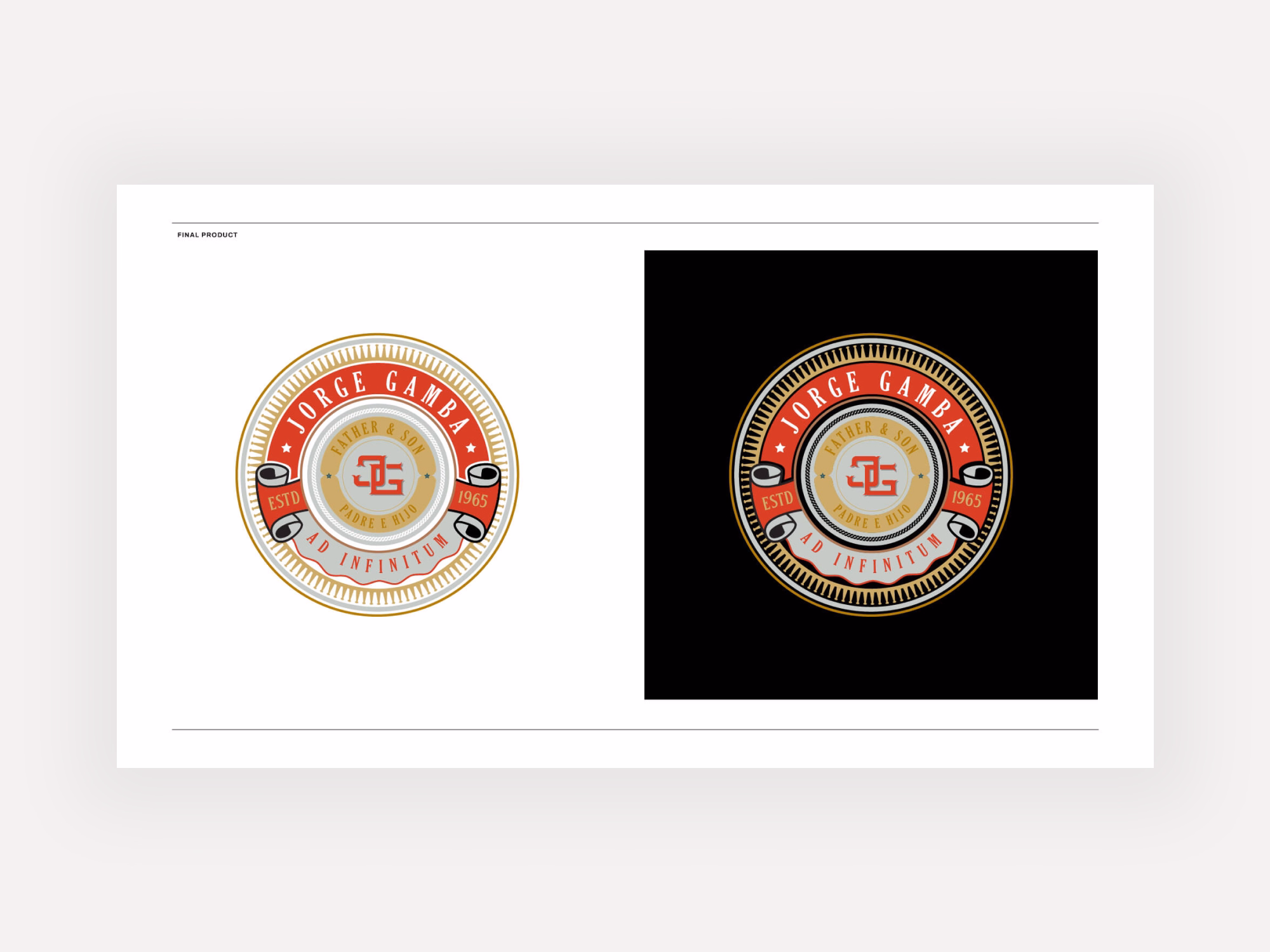
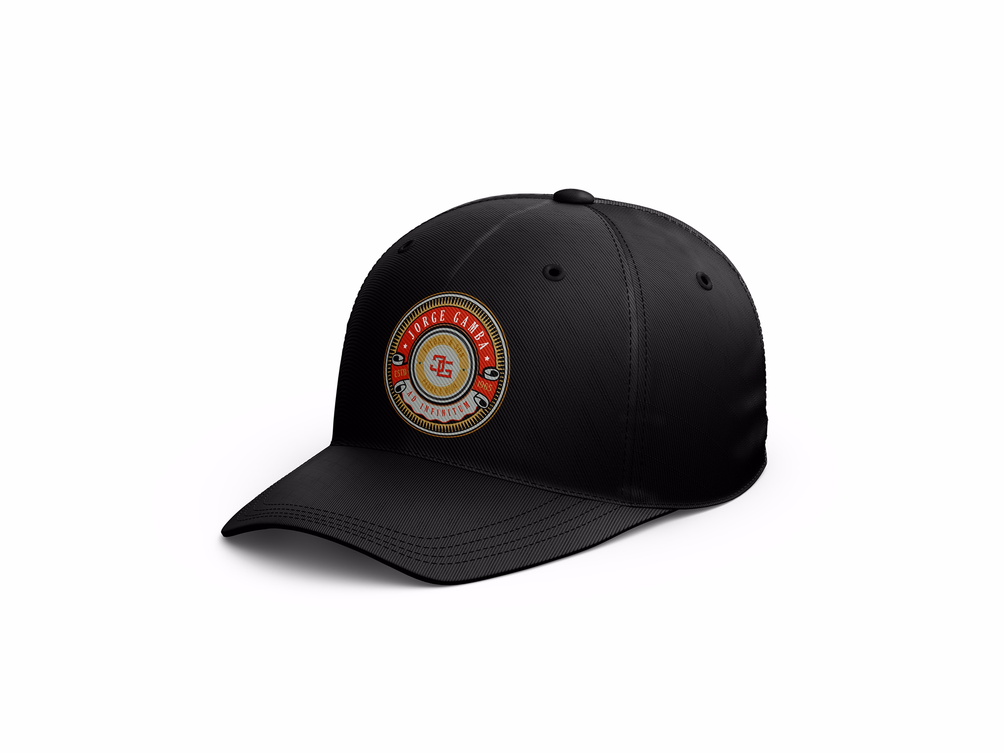
The final output was a single, resolved emblem illustration, export-ready for embroidery on a family hat. Clean vector, bold graphic, built to last.